ブログの文中で使いたい、目を引くタイトルや見出しデザインを簡単に作るためのCSSTipsを見本帳としてご紹介します。
目次
●使用方法
基本的には、コピーで使用可能です。
下の例で使っているデザインは、ほとんどh2タグにつけたクラスで実現しています。すぐ下の例でいうとex1というクラスです。
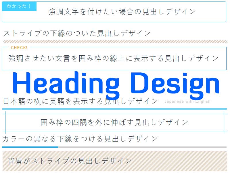
<h2 class="ex1">強調させたい文言を囲み枠の線上に表示する見出しデザイン</h2>
このh2タグのクラスを各例のクラス(ex1-ex13)に変えた上で、それにそったCSSをコピーしてください。
h2タグは、適宜h1-h6に変更してください。
現在の本サイトでは、何もクラスを付けていないときのh2のCSSは下記になります。
スマホ等のレスポンシブ対応のために単位にremを使っています。
h2{
    margin: 6rem 0 2rem;
    font-size: 1.6rem;
}
●見出し例12個
強調させたい文言を囲み枠の線上に表示する見出しデザイン
.ex1{
	position:relative;
	padding:20px 20px;
	border:1px solid #1598ec;
}
.ex1::after{
	content: "CHECK!";
	position: absolute;
	top: -8px;
	left: 20px;
	background: #fff;
	font-size: 0.8rem;
	color: #f19f06;
	padding: 0 10px;
}
囲み枠の四隅を外に伸ばす見出しデザイン
.ex2{
	position: relative;
	padding: 10px 20px;
	font-size:20px;
	text-align:center;
	border-top: solid 1px #1598ec;
	border-bottom: solid 1px #1598ec;
}
.ex2::before,
.ex2::after{
	content: '';
	position: absolute;
	top: -10px;
	width: 1px;
	height: calc(100% + 20px);
	background-color: #1598ec;
}
.ex2::before{
        left: 10px;
}
.ex2::after{
        right: 10px;
}
カラーの異なる下線をつける見出しデザイン
.ex3 {
  position: relative;
  border-bottom: 4px solid #ccc;
  line-height: 2;
}
.ex3::after {
  background-color: #03A9F4;
  position: absolute;
  bottom: -4px;
  left: 0;
  z-index: 1;
  content: '';
  width: 25%;
  height: 4px;
}
カラーの異なる下線をつける見出しデザイン2
.ex4 {
  position: relative;
  border-bottom: 4px solid #ccc;
  line-height: 2;
}
.ex4::before {
  background-color: #03A9F4;
  position: absolute;
  bottom: -4px;
  left: 0;
  z-index: 2;
  content: '';
  width: 33%;
  height: 4px;
}
.ex4::after {
  background-color: #f19f06;
  position: absolute;
  bottom: -4px;
  right: 0;
  z-index: 1;
  content: '';
  width: 20%;
  height: 4px;
}
グラデーションの下線をつける見出しデザイン
.ex5{
	padding-bottom:2px;
	font-size:20px;
	background: linear-gradient(135deg, #f44336 0%,#ff9800 17%,#ffeb3b 32%,#4caf50 50%,#2196f3 67%,#3f51b5 84%,#9c27b0 100%);
}
.ex5 span{
	display: block;
	background: #fff;
	padding-bottom:10px;
}
日本語の横に英語を表示する見出しデザインJapanese with English
スマホにも対応しますが、日本語が長い場合は英語部分が段代わりします。
.ex6 {
    border-bottom: 5px #44d0ff solid;
    padding-bottom: 5px;
}
.ex6 span {
  margin-left:20px;
  font-size:50%;
  color: #ccc;
  position: relative;
  top: -5px;
}
背景がストライプの見出しデザイン
repeating-linear-gradientを使ってストライプを作ります。
repeating-linear-gradient(ストライプの角度, 色1 始点, 色1 終点, 色2 始点、色2 終点[, 色3 始点, 色3 終点, …何色でも])
.ex7 {
text-shadow: 2px 2px 5px #fff;
padding: 1rem 1rem;
background: -webkit-repeating-linear-gradient(-45deg, #e6d9cb, #e6d9cb 5px,#f7f3ee 4px, #f7f3ee 10px);
background: repeating-linear-gradient(-45deg, #e6d9cb, #e6d9cb 5px,#f7f3ee 5px, #f7f3ee 10px);
}
先頭の文字のみ大きい見出しデザイン
.ex8 {
  padding-bottom: 0.5rem;
  border-bottom: 1px solid #1598ec;
}
.ex8::first-letter {
  margin-right: 0.1em;
  font-size: 1.5em;
  font-weight: bold;
}
ストライプの下線のついた見出しデザイン
.ex9 {
position: relative;
padding-bottom: 0.5rem;
}

.ex9::after {
content: "";
position: absolute;
left: 0;
bottom: -0.3rem;
width: 100%;
height: 8px;/*ストライプの高さをもっと低くしたい場合はこの数値を小さく*/
background: -webkit-repeating-linear-gradient(-45deg, #dbc8b4, #dbc8b4 2px, #fff 2px, #fff 4px);
background: repeating-linear-gradient(-45deg, #dbc8b4, #dbc8b4 2px, #fff 2px, #fff 4px);
}
両脇に線を表示する見出しデザイン
ポイント
・見出しが長い場合やスマホ等で横幅が小さい場合、線は切れます。
・背景が白の場合の設定ですので、白ではないときはspanの背景色を#fffから変更します。
.ex10{
	position: relative;
	text-align: center;
	font-size:20px;
}
.ex10::before{
	position: absolute;
	top: 50%;
	z-index: 1;
	content: "";
	display: block;
	width: 100%;
	height: 1px;
	background: #000;
	background: linear-gradient(-45deg, transparent, #325A8C 10%, #325A8C 90%, transparent);
}
.ex10 span{
	position: relative;
	z-index: 2;
	display: inline-block;
	padding: 0 20px;
	background-color: #fff;
	text-align: left;
}
カラーの異なる左線をつける見出しデザイン
.ex11 {
  position: relative;
  padding: .25rem 0 .5rem .75rem;
  border-left: 8px solid #439ff9;
}
.ex11::before {
  position: absolute;
  left: -8px;
  bottom: 0;
  content: '';
  width: 8px;
  height: 50%;
  background-color: #97a31d;
}
.ex11::after {
  position: absolute;
  left: 0;
  bottom: 0;
  content: '';
  width: 100%;
  height: 0;
}
吹き出し見出しデザイン
最近はいろんなところでよく見ますね。
.ex12 {
  position: relative;
  padding: 1rem 1rem;
  background-color: #ece2d7;
  border-radius: 6px;
}
.ex12::after {
  position: absolute;
  top: 100%;
  left: 30px;
  content: '';
  width: 0;
  height: 0;
  border: 10px solid transparent;
  border-top: 15px solid #ece2d7;
}
強調文字を付けたい場合の見出しデザイン
例のなかの「わかった!」部分は、h2のタイトルとして、title=”わかった!”を加えています。
<h2 class="ex13" title="わかった!">強調文字を付けたい場合の見出しデザイン</h2>
.ex13{
	position: relative;
	padding: 1rem 0 1rem 10rem;
	font-size:20px;
	border: 1px solid #44d0ff;
	border-radius: 5px;
}
.ex13::before{
	content: attr(title);
	position: absolute;
	left: 0;
	top: 0;
	padding:0 1rem;
	line-height: 4;
	font-size:1rem;
	background: #44d0ff;
	color: #fff;
}